
A bigger catalog can make an ecommerce brand look stronger while making it harder to buy from. That is the uncomfortable part of ecommerce conversion: more products create more chances to match a need, but they also create more work for the shopper.
The problem isn't variety. Variety is useful when it helps someone find the right fit. The problem is an unedited catalog that asks customers to become their own merchandisers, product experts, and comparison engine before they can spend a dollar.
Research from the INFORMS journal on choice overload points to a more nuanced truth than the usual "fewer choices are better" slogan. Large assortments can help people find a match, but only when shoppers can form a manageable consideration set. The commercial job is not to remove choice. It's to make the next choice obvious.

The catalog is not the experience
Many ecommerce teams still treat assortment as the product. Add more SKUs, more colors, more bundles, more variants. Then celebrate the size of the catalog as if customers came to admire the inventory system.
Customers don't experience your catalog. They experience a sequence of decisions. Which category should I open? Which specification matters? Is this version meaningfully different from the next one? Can I trust the review count? What happens if I choose wrong?
Every unanswered question adds cognitive cost. That cost is easy to miss in analytics because the shopper may not bounce immediately. They may open six tabs, save an item, ask a friend, or leave the site to search for a simpler explanation. The session looks like interest. The business feels the loss later.
That is why product discovery deserves the same attention as checkout. Consumer value is bigger than a lower price, and decision confidence is part of that value. A cheap product that takes twenty minutes to evaluate isn't cheap in the customer's mind.

The shortlist is where conversion happens
The highest-value moment in a shopping journey isn't the full catalog view. It's the moment a customer says, "These are the two I should actually consider."
That shortlist can be created by a useful filter, a clear best-for label, a comparison table, a buying guide, or a strong recommendation from the brand. The mechanism matters less than the outcome. The shopper should feel that the store has done some of the thinking with them.
Baymard's ongoing research into product lists and filtering shows why this gets operationally serious. Sites with mediocre product-list usability saw abandonment rates between 67% and 90% in its study. That doesn't mean every abandoned session came from choice overload. It does show how quickly a weak finding experience can become a revenue problem.
Filters are not a feature to check off in a design review. They are a merchandising system. A filter named "performance" means very little unless the shopper knows what performance changes in real life. "Suitable for small spaces" is useful because it translates a specification into a decision.

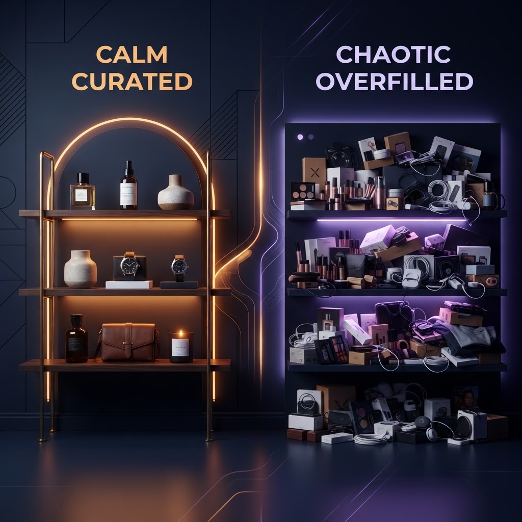
Curation beats catalog bragging
Brands often resist curation because it feels like hiding inventory. The fear is understandable. If a product doesn't appear in the first screen, someone assumes it won't sell.
But curation isn't deletion. It is sequencing. Put the most broadly useful option first. Group products by real customer missions. Separate good, better, and best without pretending every difference is meaningful. Give unusual products a reason to exist beyond "new" or "featured."
A useful collection page answers a question before it displays a product. Best for commuting. Best for sensitive skin. Best for a first purchase. Best under a specific budget. These labels reduce the distance between a customer's life and your internal product taxonomy.
This is also where brand voice earns its keep. A retailer that can explain why one item is a smarter starting point than another feels more trustworthy than a retailer that dumps 400 nearly identical options into a grid.
Mobile makes the problem louder
Choice overload is expensive on a desktop. On a phone, it becomes exhausting.
A mobile shopper sees fewer products at a time, loses comparison context more easily, and pays a higher interaction cost for every filter, sort, and product detail page. If the site makes the shopper remember what they saw three screens ago, the brand is outsourcing its merchandising problem to the customer's working memory.
The fix isn't simply a larger filter button. Mobile needs stronger defaults. Show a useful starting collection. Preserve selected filters. Make the difference between variants visible without forcing a new page. Keep the recommendation attached to the reason it exists.
The same principle applies to social commerce. As I wrote in the shift toward checkout inside social platforms, every extra step changes the buying habit. Discovery surfaces have to do more editorial work because the customer arrives with less patience and less context.

Measure confidence, not just clicks
Most merchandising dashboards reward activity. Product views, filter usage, comparison clicks, wishlist adds. Those numbers matter, but they can also hide indecision.
Add signals that show whether the experience is helping someone decide. Track the number of products viewed before purchase. Compare conversion after a shopper uses a buying guide or a mission-based collection. Look at repeated visits to nearly identical product pages. Watch search refinements that move sideways instead of narrowing the field.
Then connect those behaviors to customer language. Search terms, support questions, returns, reviews, and post-purchase surveys will show you where the catalog is asking customers to make distinctions they don't actually care about.
A product team might discover that shoppers aren't asking for more colors. They're asking which color hides wear. They aren't asking for more technical specifications. They're asking whether the product will work for a particular situation. That is a merchandising insight, not a copy tweak.

The merchant's job is judgment
Automation can sort a catalog. A brand still has to decide what deserves emphasis.
That judgment shows up in the products you put first, the differences you explain, the tradeoffs you admit, and the options you leave out of the opening path. Customers don't need a store to prove it has everything. They need a store that understands why one option fits their situation better than another.

The brands that win from assortment won't be the ones with the longest product pages. They'll be the ones that turn a large inventory into a small moment of confidence.
That is the real ecommerce conversion opportunity. Not more choice. Better judgment, surfaced at the exact point where a customer is ready to use it.